(970) 927-9668
A self-taught printmaker and compulsive wanderer of landscapes, Sherrie York finds her inspiration in the natural world. A long-ago college field trip to draw backyard chickens was the unexpected genesis of a career that encompasses environmental education, natural history illustration, birding, and printmaking. Through the medium of linocut Sherrie finds her way to place, inspired by personal experiences and discoveries as she explores the natural world from mountains to the sea. Below, York shares thoughts on her process and subjects, the changes from moving from Colorado to Maine, and the universal beauties: birds.
When I lived in Salida I had a regular “patch,” a 3.5-mile route that I walked several times a week. My patch included two small lakes, a section of the Arkansas River, a state fish hatchery, and a long stretch of open mesa top.
One of the lakes stays open all winter long, and many species of waterfowl congregate there in good numbers. I loved walking down the hill to the lake on winter mornings… the bird chatter growing as I approached, and I was always a little sad when spring arrived and most of the waterfowl dispersed to nesting grounds elsewhere.
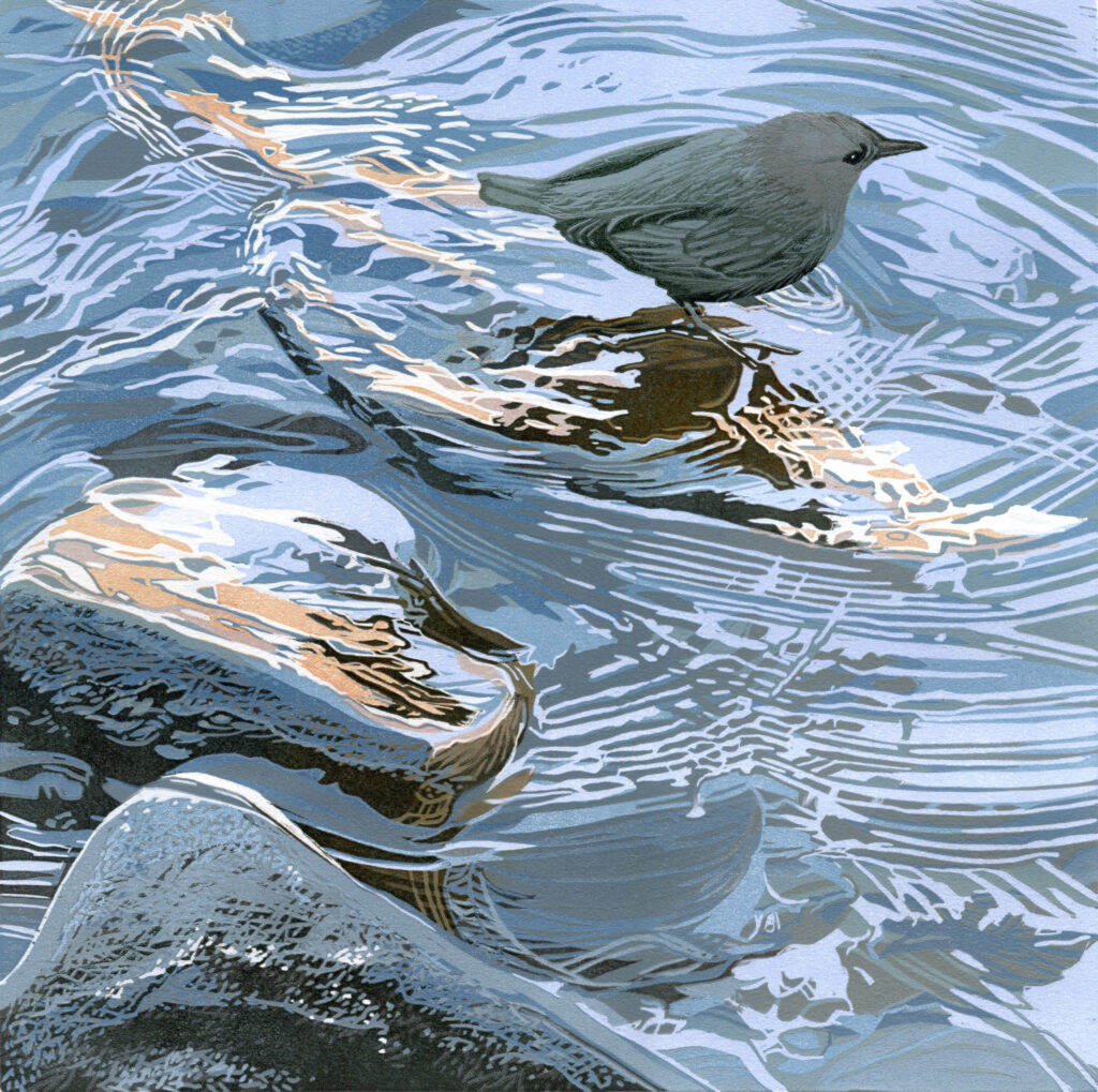
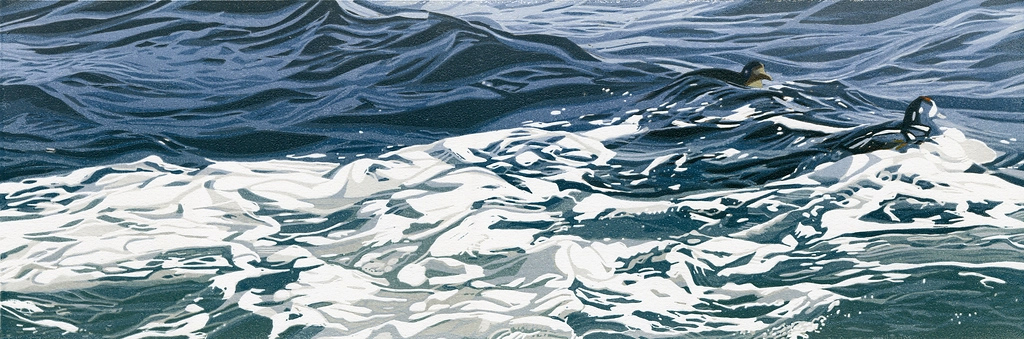
When I moved to Maine I moved away from that patch, which was the inspiration for probably 85 percent of the images I had been making. I’ve yet to find a comparable lake patch here, but I’m learning to work with the broader patterns of ocean and seabirds.
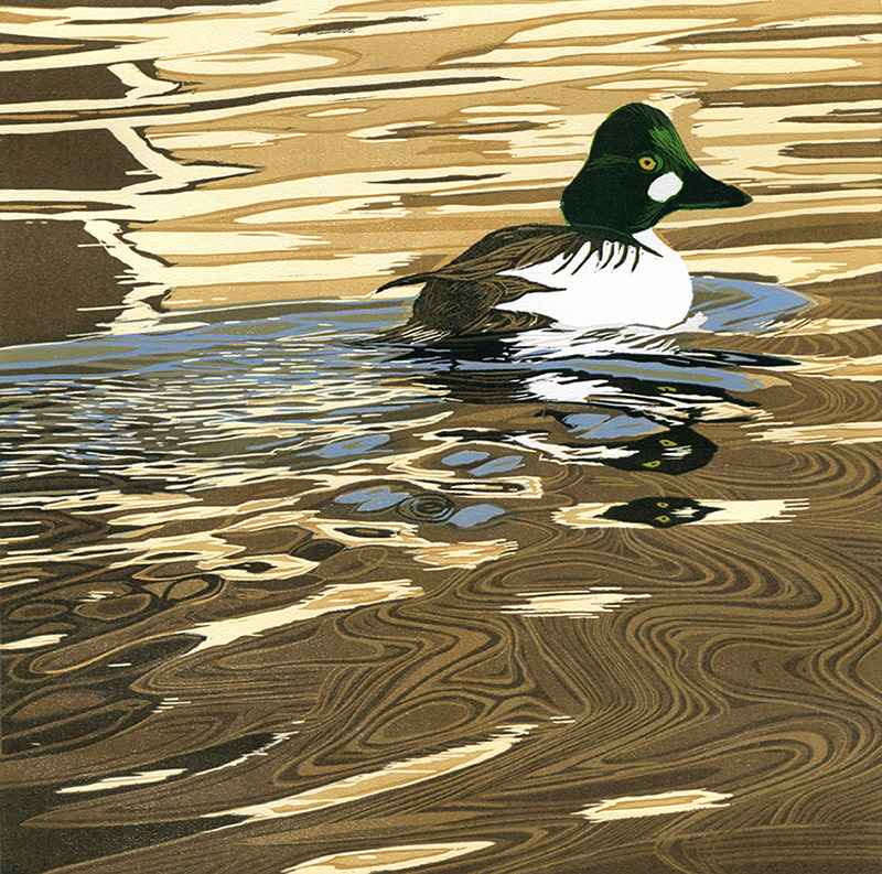
Before I focused on a fine art practice I worked as a graphic designer, and from time to time I still undertake design projects for conservation organizations. My own aesthetic sensibilities are often drawn to strong graphic images, and many species of waterfowl have graphic plumage patterns. Goldeneye, Harlequin Ducks, Buffleheads, and Hooded Mergansers are favorites, and I have been known to assert that these species evolved mostly to provide printmakers with great subject matter. Of course water provides endless permutations of color and pattern to explore, so birds and water together are quite irresistible.
I am not much of a planner, which is clear to anyone who reads my blog. I tend to just jump in to an image with an idea of where I’d like to go, but no real map for getting there. The initial inspiration for a piece always comes from long walks in nature with binoculars, sketchbook, and camera.
There is one part of the process that must be planned, however, and that is the composition. Once I get the first color printed on paper, I can not decide that the bird would be better a half inch to the right and move it. It’s too late! I can’t paint over it and move it.
I never really know how to describe how I decide on a composition, other than to say that I move the elements of photographic references and sketches and personal experience around until the composition feels right. And I do mean that literally. There’s a physical feeling of “rightness” when I arrive at a composition that I feel good about. As long as the major elements are in the right place, then I have room to experiment with color and value to get to the mood I want to convey. But the underlying structure has to be there before I ever roll the first ink color on to the block.
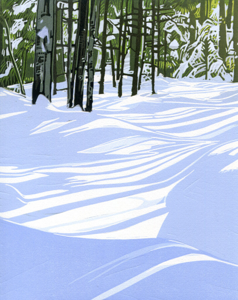
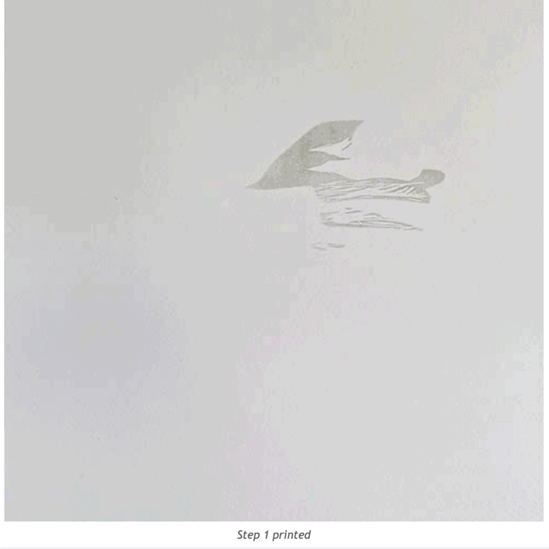
Snow shadows! Of course, shadows on snow provide another opportunity to celebrate the graphic patterns found in nature. In the reduction printmaking process, the first step is to carve out of the block any parts of the image that will remain white (the color of the paper). Which for a snow scene often means that I have a lot of carving to do before I ever roll out the first ink color! It can be very satisfying to get this big compositional element established so early in the process.