(970) 927-9668
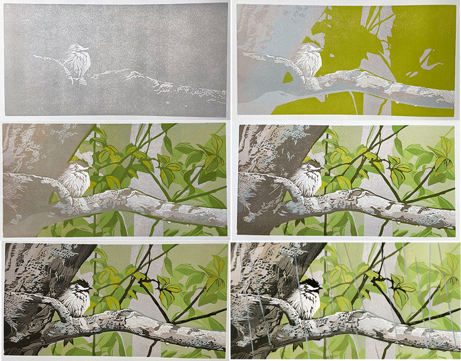
The reduction linocut process requires the artist to think about an image “upside down and backwards.” Starting with a solid linoleum block, each step is a dual process: carving away a block and rolling it with ink, then printing it (over and over again) in each stage. For an edition of 18, an artist may start with 25 sheets of paper, losing some to the edition through process of experimentation or color testing, errors in registration, unintended ink, etc. So, you can imagine, a 16-step printing process for an edition of 18 could mean a minimum of 400 prints.
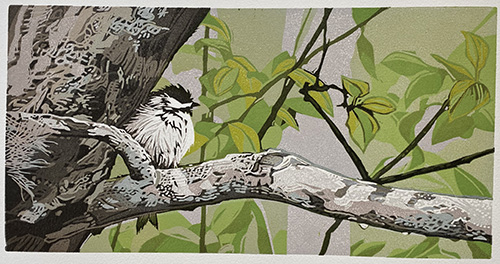
Printmaker Sherrie York takes us through the process of her “Rainy Days and Mondays” print, starring a rain-soaked black-capped chickadee she observed one rainy day. Enjoy highlights of each step, with the block and color rolled out on the left, and the resulting print on the right, and commentary from Sherrie as to her thought process, challenges, surprises and glimmers.
Excerpts shared from the blog of Sherrie York, Brush and Baren detailing the making of Rainy Days and Mondays, a reduction linocut by Sherrie York available at Ann Korologos Gallery. This has been shortened and edited for clarity and brevity.
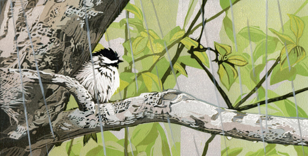
On rainy days I often think of the children’s book, Where Does the Butterfly Go When It Rains? In all but the worst weather I still see birds coming back and forth to my feeders, but where do they go when they dart away with their snacks? One particularly drippy morning my question was answered when I spotted a very wet and rather disheveled black-capped chickadee tucked up tight against the trunk of a tree, sheltering as best it could. At that moment the voice of Karen Carpenter popped into my head, and this linocut seemed inevitable.
Establishing the earliest shapes and color foundation of the chickadee composition. White highlights added now.
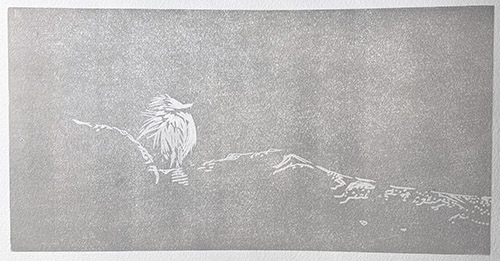
The first big questions, before I even started, were whether or not I would suggest the actual rain and, if so, should it be represented by white or light gray lines? In the case of white or light gray lines they would need to be carved out NOW and held open for the duration of the process.
Hm.
I looked at how Japanese printmakers handled rain… mostly with the thinnest of black or dark gray lines.
I decided not to decide, and to just plan to cut a completely separate block with which to print an overlay at the end. Would this come back and bite me in the butt? Maybe.
Print the next layer and start building the structure that will eventually define the bird and surrounding branches.
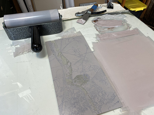
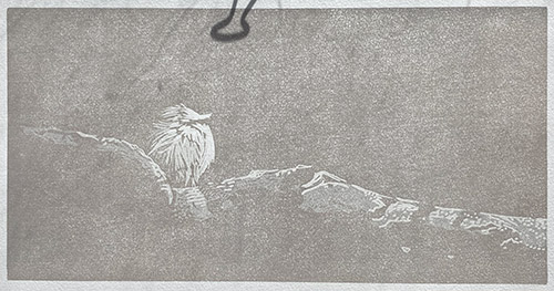
I wanted to warm up the tone a bit… this will be a balancing act that will challenge me the entire way through. Too warm? Too cool? Honestly, the rollup here looks rather pink. It’s a problem I often struggle with when working with browns. But hey, at least the brown doesn’t look so pinkish on top of the gray. You knew that would happen, didn’t you?
Use a mask to protect background, and add suggestions of blue-green lichen.
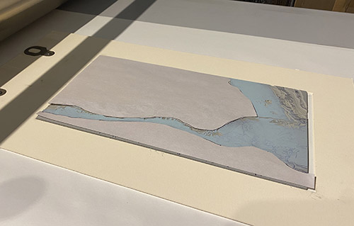
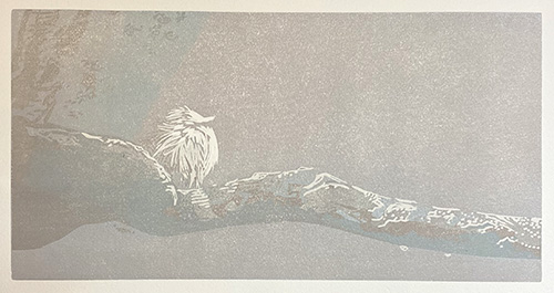
There are some lichen on the tree, which I’d like to suggest, so I mixed up a lichen-y blue green. I wanted to contain this color only in the foreground tree, so cut some newsprint masks and printed away.
I thought this already seemed a bit dark, but I know from experience not to panic too much about value in these early stages, because once the actual dark bits start coming into play everything changes. So far, so good.
Add first pass of green to the background.
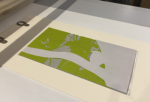
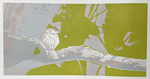
It did take a few tries to hit the correct green for this stage. Initial attempts were way too bright. Even after I settled on a color and printed the entire run, I wasn’t sure it was quite right.
A transparent layer manages values and adds definition to the leaves.
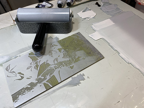
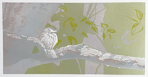
The next day I decided it was too much, too soon. Right color, wrong stage of the process. Nothing to do but overprint a semi-transparent white-to-gray blend and tone it all down. Yes, that’s better… and I got the intermediate green in the bargain. It’s always a bit of a head-scratcher when I have to think inside out about values. Before I overprinted, I did, of course, carve away the areas where I wanted this green to remain, but I had to remind myself these were not the lightest bits of green.
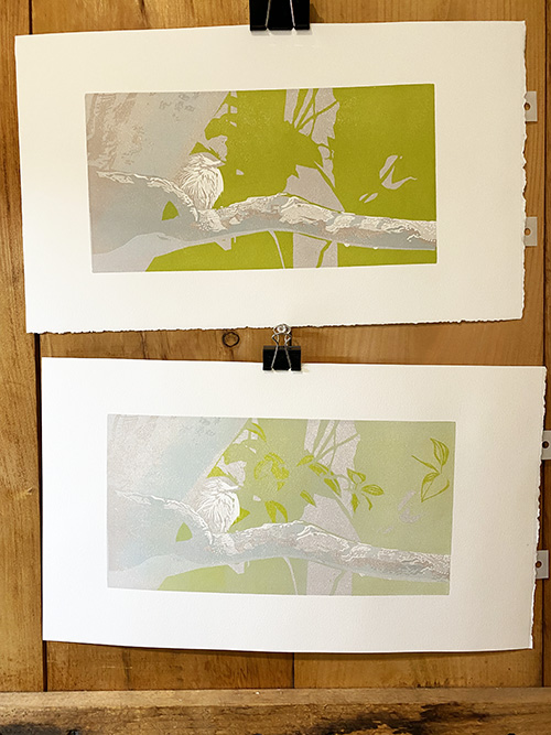
Reduce the block further, adding form and depth as more of the final composition starts to emerge. Mask protects foreground.
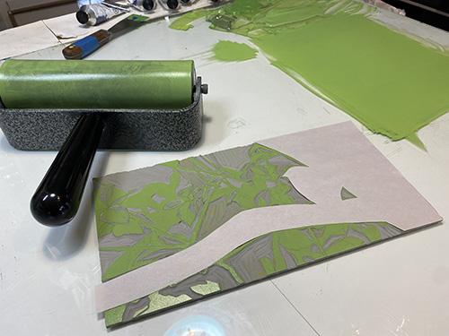
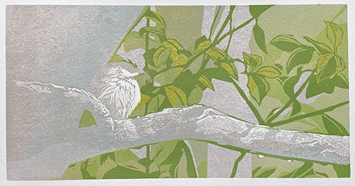
At this stage I needed to think more about not letting the green interfere with the bird and the tree branch, so I cut some newsprint masks again. This print ended up being a festival of masking, and I realized it might have been easier to cut two different blocks from the get-go.
Print a middle-value layer that begins creating atmosphere and depth. Mask removed, adding middle value to foreground and background.
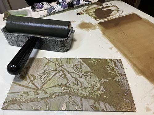
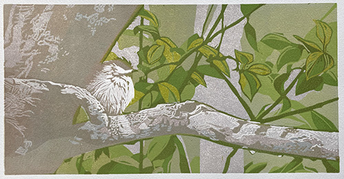
I wanted to tie things back together after the masking to get a better sense of where I stood overall with values, so I mixed up a fairly transparent brown. The reddish tones would (I hoped) create darker, subtler greens while also warming up the tree and giving it some form. And can I just say how satisfying it is when an intention actually works out more or less as I envisioned?
Using a mask, strengthening the color of the lichen.
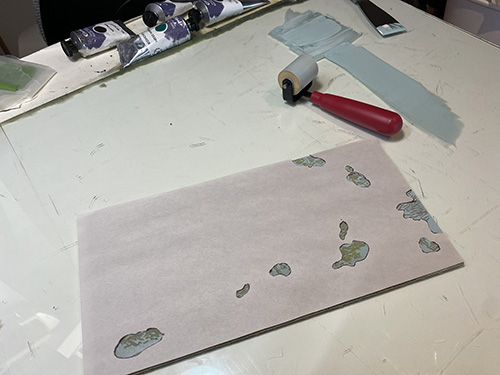
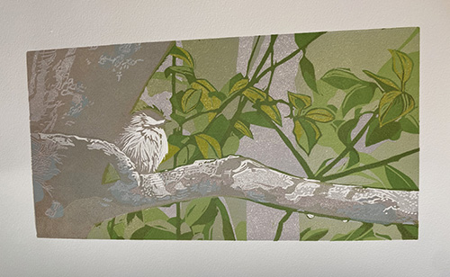
Riding high on this satisfactory color pass, I decided to descend into pickiness and beef up some of the lichen color just a bit. Back to the fussy mask cutting to strengthen the color of the lichen. It did strengthen the color a bit, so on we go.
Introduce darker values that strengthen contrast and give the image more visual weight.
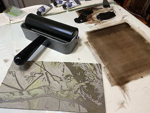
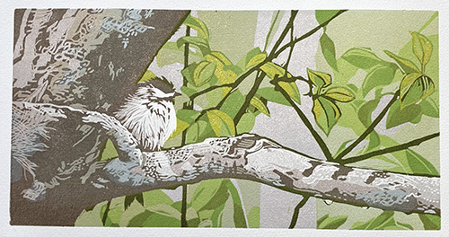
After all that green it’s time to start defining the tree and bird a bit more, and to start balancing the values. Let’s warm things up a bit with a reddish-brown. It’s a bit of a relief (pun intended) to get this color pass down and see that everything is holding together okay. Promising! But of course I saw a teeny thing that I didn’t like…
Continue carving carefully, preserving highlights and preparing for the final stages.
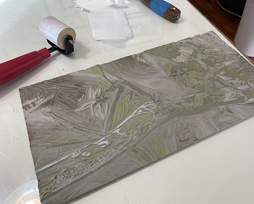
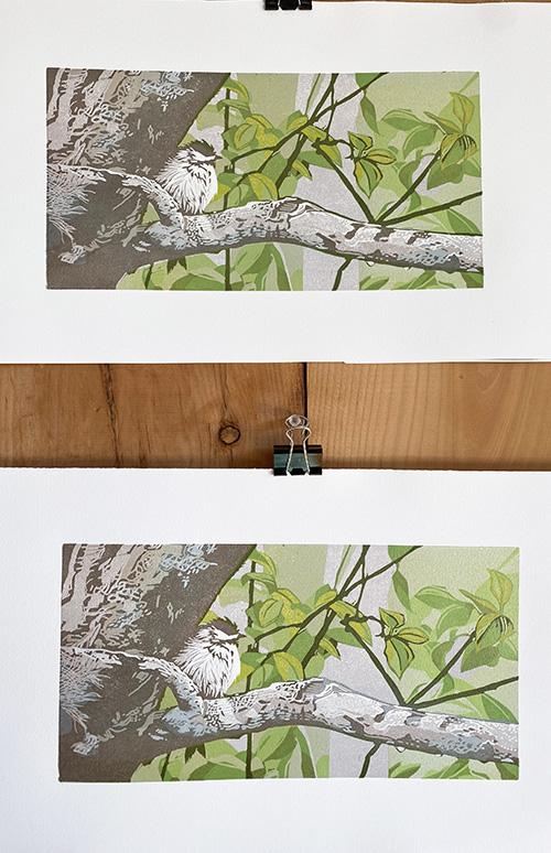
The top edge of the horizontal branch on which the bird is perched is too dark and harsh. It’s a little thing… but it bothers me, so I will fix it with some spot inking. Nothing complicated, just a semi-transparent white rolled over that little section.
Print another dark layer that brings greater clarity and definition to the scene. Refine the smallest details, which often require the greatest patience and precision.

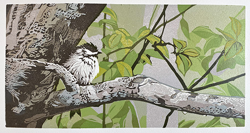
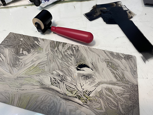
There’s not a lot of material left on the block at this stage… but somehow there are still several steps left to go.
I think I can finally move away from the background and add some more details in the foreground tree. I don’t seem to have a rollup photo for the next step, but I’m willing to bet you can tell it was a slightly darker brown layer. And now Step 13! Again, a dark brown, this one a bit cooler in temperature, to bring out the last (???) bits of detail in the tree.
Make final adjustments and carve away nearly everything remaining on the block.
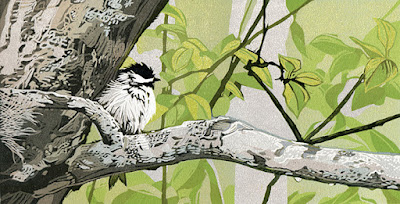
Okay, let’s wrap this thing up, shall we? How much more can there be? There’s almost nothing left on this block! The background is done, the tree is 99% done. All that needs to be done is a slight darkening of the bird’s head markings, and maybe a few tiny dark spot in the tree branch, just to tie it all together.
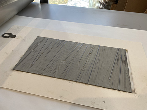
Using a second block, reducing block so only streaks of rain will print with transparent grey.
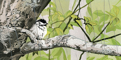
At this point I made a proper scan so you can get a better idea of the actual color balance. We’re finished, right? Well, yes, that all looks nice and I’m satisfied (as much as I ever am) that this image reflects what I saw out my window. But what’s missing for me is the why. Why is this little chickadee all fluffed up and snugged up next to the tree trunk!
Because it was raining, that’s why! You can see a couple of drops on the underside of the foreground branch, but I wanted to suggest a more active rain situation. I had considered cutting away white lines for the rain at the very beginning of this process, but it seemed a risky idea, since I had no idea how many lines I wanted and whether white was really going to be the color they needed to be.
I decided to complete the entire image sans rain, hoping that a decent image would emerge with or without that extra bit, and to use a second block as an experiment in overprinting.
Thus began several days of headscratching and block carving and a bit of test printing. The flaws in my first idea became quickly apparent, so I abandoned block #2 and started over with block #3. After a few more tests I settled on these few lines and a medium-light gray ink.
Adding a fine white shimmer to the streaks of rain.
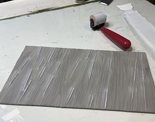
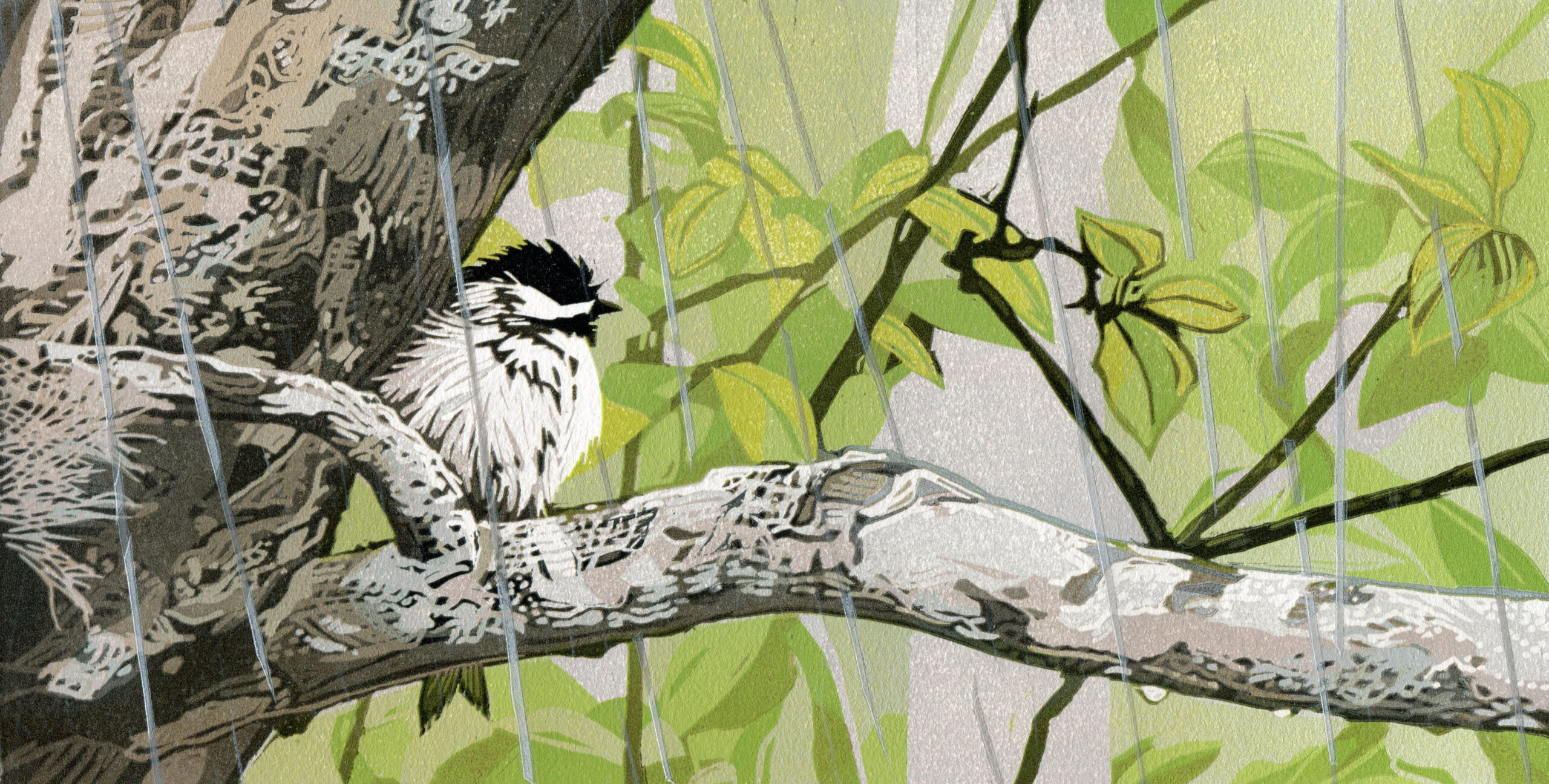
I thought I was done at this stage… subtle, but a nice suggestion of rain a la Japanese printmakers. I made a scan, called the file FINAL. But after a few days I decided it needed one more bit of something. More carving of these little lines happened, and then a layer of transparent white ink was rolled up. This was super tedious to print! Difficult to keep extraneous ink out of the background, so every inking required several minutes of wiping out around the lines. But I got there in the end.
Printmaker, painter and draughtswoman Sherrie York is an accomplished artist with an international reputation for lyrical and expressive works on paper. The beauty and mysteries she discovers on her walks inspire York’s nature-focused linocuts. Her printmaker’s eye is drawn to intricate flora, the behavior of birds, and patterns across land and seascapes.

